Deepening Spotify Listener Identity & Engagement through Data Visualization
Brandon Lu | May 6, 2019
Introduction
In the past few years, music has played a significant role in my life. Through playing, discovering, or sharing it, I have connected with new friends, explored creative projects, and expressed myself.
This project is a data study/product proof-of-concept that:
Analyzes the evolution of music genres over time
Classifies artist discography in relation to their primary music genre
Creates an ‘audio identities/user personas’ to deepen listeners’ relationship with their music library
Simply put, we are looking to explore:
How might we deepen listeners’ relationship relationship and engagement with their music library through data visualization?
Part 1. A Brief History of Popular Music

"I want to make heart decisions in business. If you can’t do that, you’re not free. I want to be able to dictate which way I’m going to go." -Prince
Art credit: POP Art 4 Digital Art by Gary Grayson
As one of pop music's most influential icons, Prince believed that he had the freedom to dictate his music's artistic direction. In the first part of this analysis, we will see how popular music has evolved over the year.

YoY change in average danceability, energy & valence

YoY change in average speechiness, acousticness, liveness
Analysis
On the left, we see that the average valence (overall positiveness of a song) has decreased by roughly 0.12 points since 1960. There is also a peculiar spike in average valence of pop music during the 1980s. When we look more into this time period though, we see that the decade saw the reinvention of Michael Jackson, the stardom of Prince, and the rise of Madonna and Whitney Houston. As some of the most successful musicians of the time, there was an emergence of dance music. This is supported by an increase in average danceability for that time period as well. Similarly, the average track energy has increased since 1960. By 2010, the average pop song had an energy value of 0.78—an increase of almost 0.30 since 1960. The latest peak in energy around the 2010 mark is likely because of the rise of EDM (electronic dance music) in mainstream culture.
On the right side, I looked at speechiness, acousticness, and liveness. The first, and least significant metric here is liveness, which just refers to how many tracks appear to be recorded to be performed live. This remains relatively constant throughout the years. Speechiness, also remained constant for a majority of the Billboards in the past, but there is a small spike in the mid 2000s. At this time, popular music was led by artists such as Britney Spears and Justin Timberlake. I would go out on a limb and say that Eminem may have had something to do this with spike, whether one argues he fits under popular genre or strictly hip-hop genre. The most prominent change is the decrease in acousticness. In 1960, the average acousticness was about 0.65, whereas it is only around 0.18 in 2015. With the introduction of synthesizers and other electronic music tools, popular music has shaped to take on a less acoustic tone.
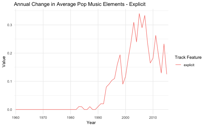
Fun Fact: The Billboard Top 50 Pop was NEVER explicit between 1960 and 1980. Then within the past three decades, it has jumped upwards by roughly 0.36! Holy s**t.

Most commonly used words in pop lyrics, 1960-1969

1960s pop was all about that looove

Most commonly used words in pop lyrics, 2000-2009
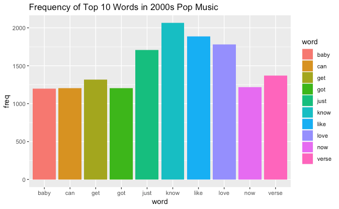
2000s pop grew to be less loving :(
Part 2. Contemporary Pop Case Study: Ariana Grande & Khalid
Fun fact: Ariana has six dogs; these are called Coco, Toulouse, Ophelia, Fawkes, Cinnamon and Sirius Black
Methodology
Now, that we have a macro idea of pop music trends over the course of the past 50 years, let's focus on two contemporary artists that combine to have more than 90 million monthly active listeners on Spotify. 26-year-old, Ariana Grande, and 22-year-old, Khalid Robinson have dominated the charts in recent years, and are pioneering a wave of contemporary R&B in mainstream music.
Below, I have visualized the valence and danceability distributions for both artists' discographies. These plots take the individual valence/danceability values of each song within an album, and produces a holistic view of an album's valence/danceability distribution shape and range. Since they are density plots, we can infer how an artist's album is balanced relative to their other bodies of work.
Analysis
For example, the valence distribution for Ariana Grande's thank u, next album is unimodal around a value of ~0.38. In contrast, the valence distribution for Yours Truly is more uniformly distributed. This comparison is insightful because it supports a common critique of pop music—that it all sounds the same:
"In a 2014 study, researchers from the Medical University of Vienna in Austria studied 15 genres and 374 subgenres. They rated the genre's complexity over time — measured by researchers in purely quantitative aspects, such as timbre and acoustical variations — and compared that to the genre's sales. They found that in nearly every case, as genres increase in popularity, they also become more generic.
This can be interpreted as music becoming increasingly formulaic in terms of instrumentation under increasing sales numbers due to a tendency to popularize music styles with low variety and musicians with similar skills."
While many other factors play into this theory, valence seems to be one of them. Whether you believe Ariana Grande followed the trend or blazed the trail for modern day pop, her latest album is much more homogenous compared to her breakthrough 2013 release, "Yours Truly".
In comparison, Khalid's album valence and danceability distributions look different. His valence distribution are all unimodal with valence scores between 0.35 and 0.44, aligning with most other pop songs today. Khalid's danceability plot, however, is more interesting because each album seems to have a difference distribution with American Teen as his definitively most dance-friendly album.
Part 3. Defining My Own "Music Genre"
In the last part of the analysis, I wanted to compare my listening history/behavior to a variety of genres. Using Spotify's APIs, I will be using my account's 50 all-time played songs to represent my personal "music genre". I also gathered data on the US Top 50, Are & Be, and mint playlists as proxies for pop, r&b, and electronic music genres, respectively. Below, I have visualized each the aforementioned "music genres" on their average values for each of Spotify's 6 key track features. You can toggle the layers by clicking in the legend.
At first glance, mint has is the most high-energy, and pop music, the most danceable. When toggling between the playlists, it is evident that my personal library's distribution is most similar to that of Are & Be. The only discernible differences are in acousticness and valence.
Fun Fact: The first song I downloaded onto my iPod was “Shake It - Metro Station”
Additionally, in the scatterplot below, I plotted my top 50 songs along its valence on the x-axis and energy on the y-axis. By breaking the plot into four quadrants, I wanted to create my own four categories of music—angryboi, chillboi, hyperboi, and sadboi. A majority of songs on my all time Top 50 fall below 0.5 on valence, but above 0.5 in energy. This is just one example of ways to categorize and benchmark one's Spotify listening habits using Spotify's track features. If you hover over the plot, one can see the specific songs within my top 50.
Conclusion
How might we deepen listeners’ relationship relationship and engagement with their music library through data visualization?
As my first data project using Spotify's APIs, this experience was very fulfilling. The greatest challenge was deciding which type of visualizations would illustrate my takeaways and arguments most effectively. Through this project, I learned how to develop a wider range of visualizations using R and embed plotly visualizations into a website. I was surprised by the vastness of data available and have developed a newfound appreciation for the potential of data insights in our daily lives.
However, while I learned a lot about pop music and myself, I can't help but feel like this project left me with more questions than answers.
With the power of Spotify's artist and track data, I was able to highlight historical trends and key milestones in pop music, visualize the relative album homogeneity of two of today's largest artists', and benchmark my own listening behaviors against various genres. Yet, this project barely scratches the surface of the potential of Spotify's APIs. While this project started as a simple exploration into music history and genre studies, it has evolved into an example of what is possible with just one API and an IDE (integrated development environment) for statistical computing.
With the exponential growth of data, machine learning, and artificial intelligence in our evermore digital society, who will be responsible for data regulation? What will we learn about our world, each other, and ourselves? How will we balance privacy and human liberties with security and order? There are infinite decisions to drive, predictions to make, and stories to tell through data, and as we navigate through life's uncertainties, I think data will be, whether you are ready or not, our new north star.
Methodology & Sources
Sources: all of the data used in this project was gathered through the Spotify API and two R packages, spotifyr and billboard.
Using the billboard r package, I had access to a data frame that held the top 100 Billboard hits in the United States between 1960-2015. Within these 55 years, I took the average danceability, energy, valence, speechiness, acousticness, and liveness metrics and grouped them by year. For context, all of these features hold a value between 0.0 and 1.0, and are determined by Spotify. The resulting graphs plot time against average track feature value.